ELEVATING WEB EXPERIENCE
Elevating Property Searches: Designing and Prototyping a Minimalistic Real Estate Platform
COMPANY
Harbor Homes
ROLE
UI/UX Designer
EXPERTISE
Web Design
YEAR
2024
Project Description
The project focused on designing and prototyping a user-friendly real estate website with a clean and simple interface. The goal was to create a platform that streamlined property searches, making it easier for users to browse, filter, and find properties that matched their needs. The design emphasized clarity and ease of navigation, ensuring an optimal experience for both first-time users and frequent visitors.
The website featured core functionalities like advanced property search filters, high-quality property visuals, and intuitive navigation. It was designed to cater to users seeking simplicity while maintaining a modern and professional look.
Timeline
Duration: 4 weeks
Week 1: Research and Planning
Week 2: Wireframing and Visual Design
Week 3: Prototyping
Week 4: Testing, Feedback, and Refinements
Background
The real estate industry often suffers from websites cluttered with excessive information and complex layouts, which overwhelm users and hinder their decision-making process. This project aimed to tackle these issues by creating a clean, focused platform that prioritized user needs and provided a seamless property-browsing experience.
Key Objectives:
Simplify the property search process with user-friendly filters and navigation.
Present properties in a visually appealing manner using high-quality images and concise descriptions.
Ensure a responsive design for both desktop and mobile users.
Problems Identified
Complex Navigation: Real estate websites often have confusing menus and unintuitive search functions.
Information Overload: Users frequently face pages cluttered with unnecessary details, making it difficult to focus on relevant properties.
Inadequate Mobile Experience: Many platforms lack responsiveness, leading to a subpar experience on smaller screens.
Visual Inconsistencies: Poorly designed property listings and inconsistent layouts can diminish user trust and engagement.
Process
Research & Planning
User Research: Conducted interviews with potential users, including property seekers and agents, to identify pain points and preferences.
Competitor Analysis: Studied popular real estate platforms like Zillow and Realtor.com to pinpoint areas for improvement.
Feature Prioritization: Defined essential features such as:
Advanced search filters (e.g., location, price range, property type).
Property details page with high-quality images and maps.
Simplified contact forms for inquiries.
Wireframing
Created wireframes for the key pages:
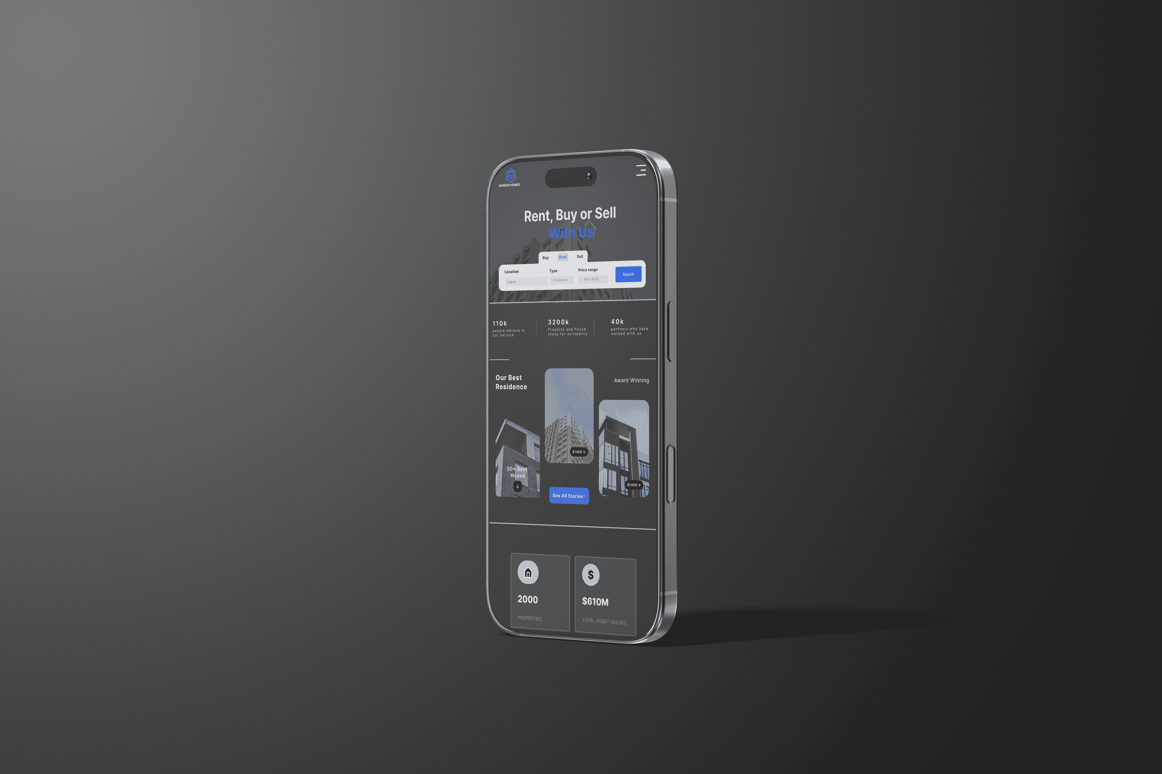
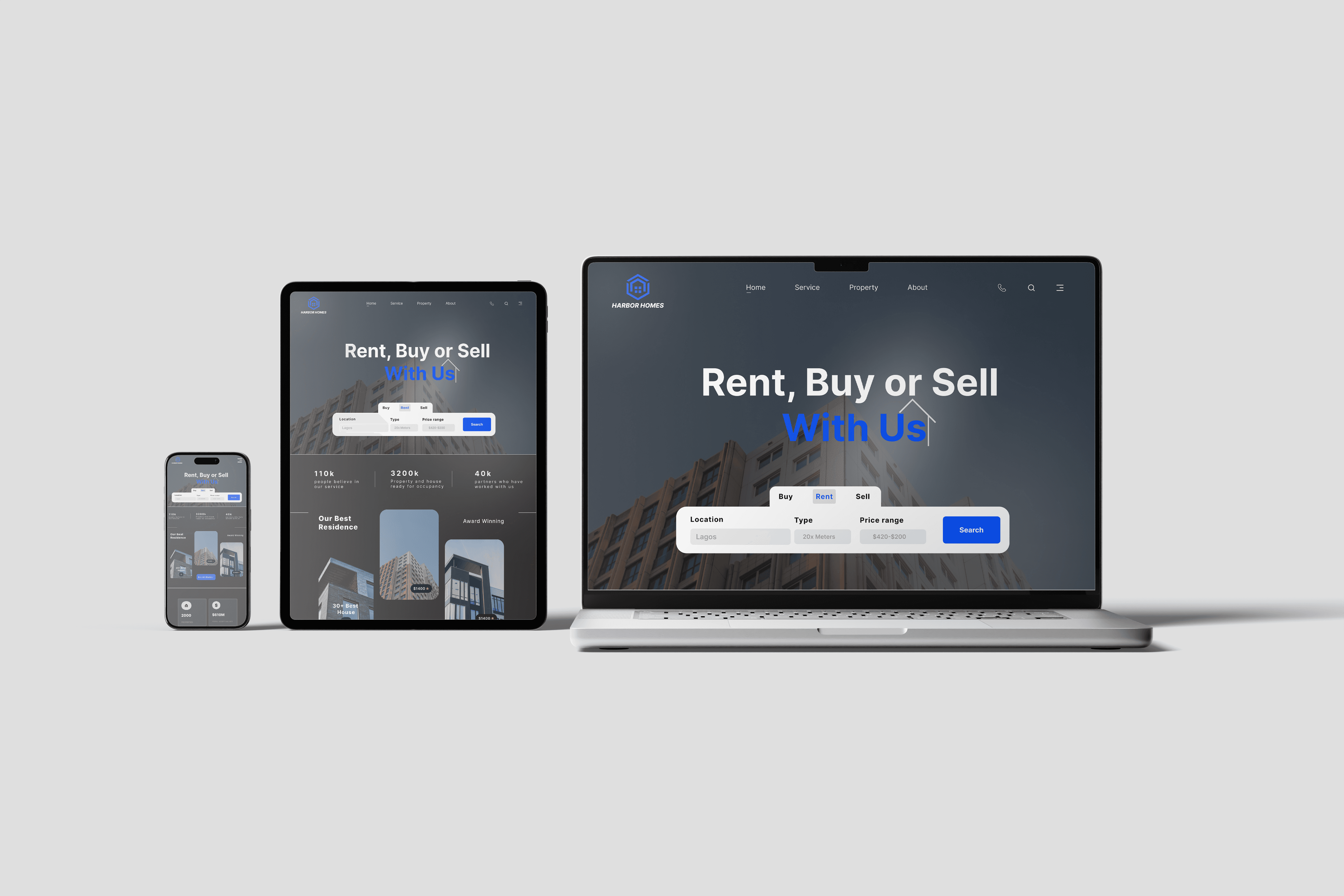
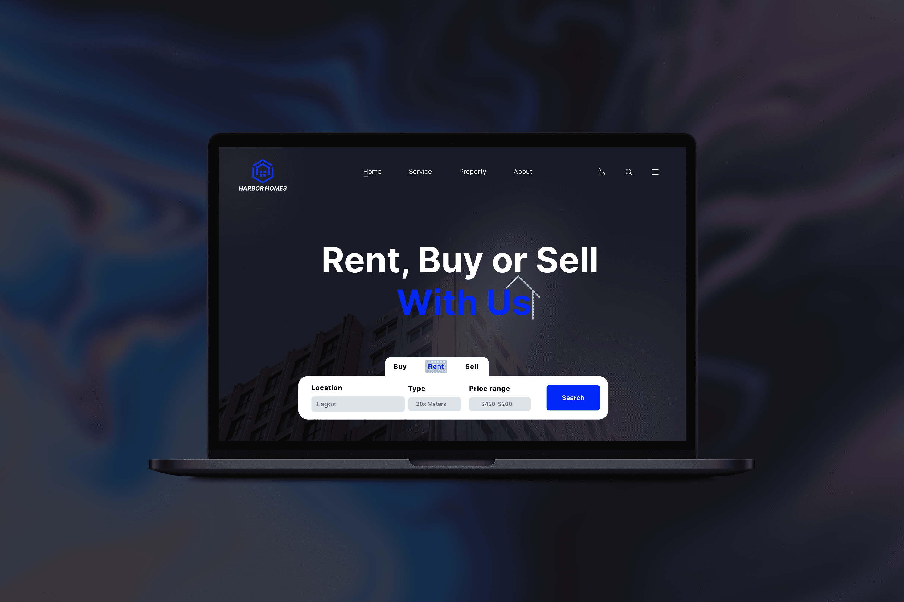
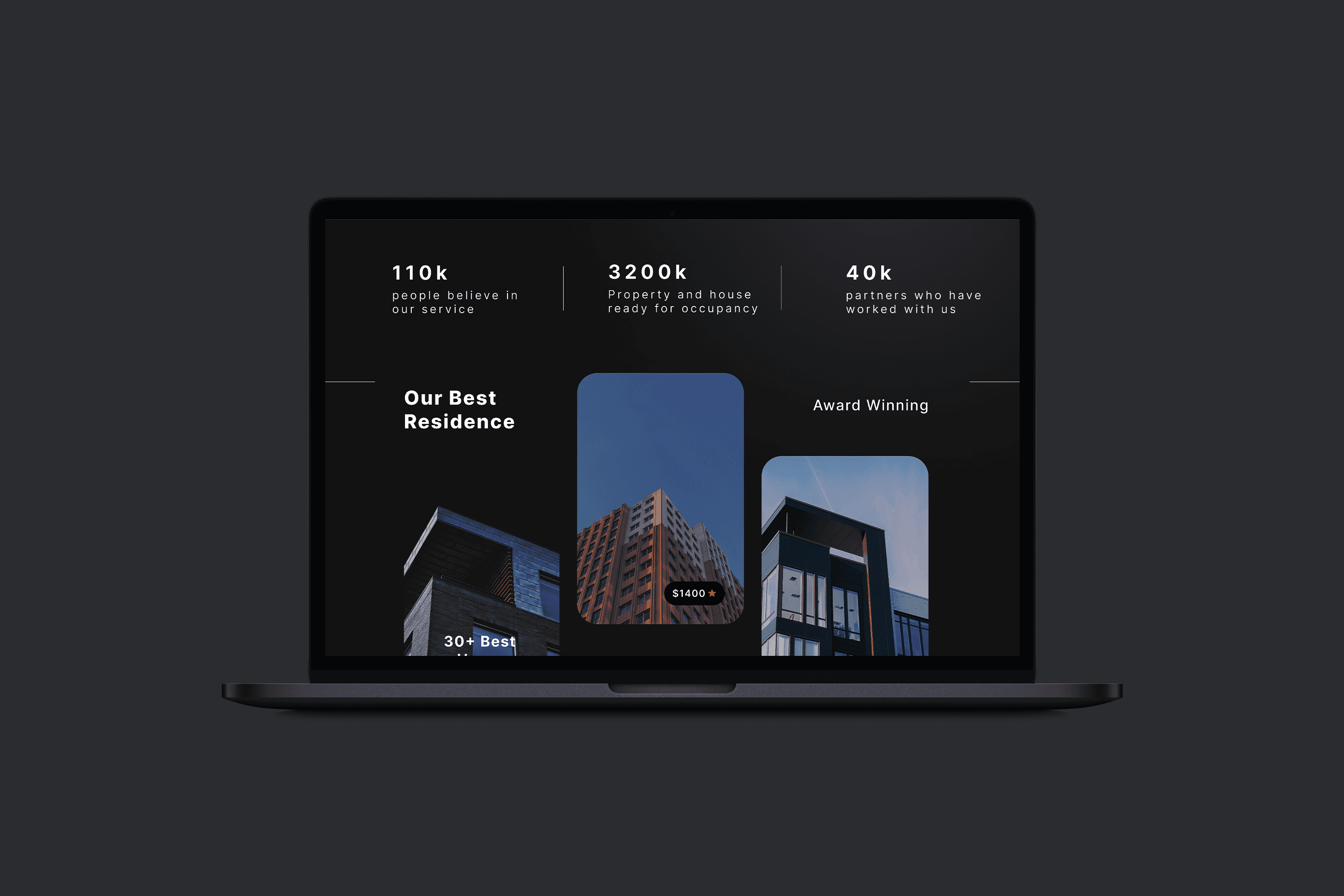
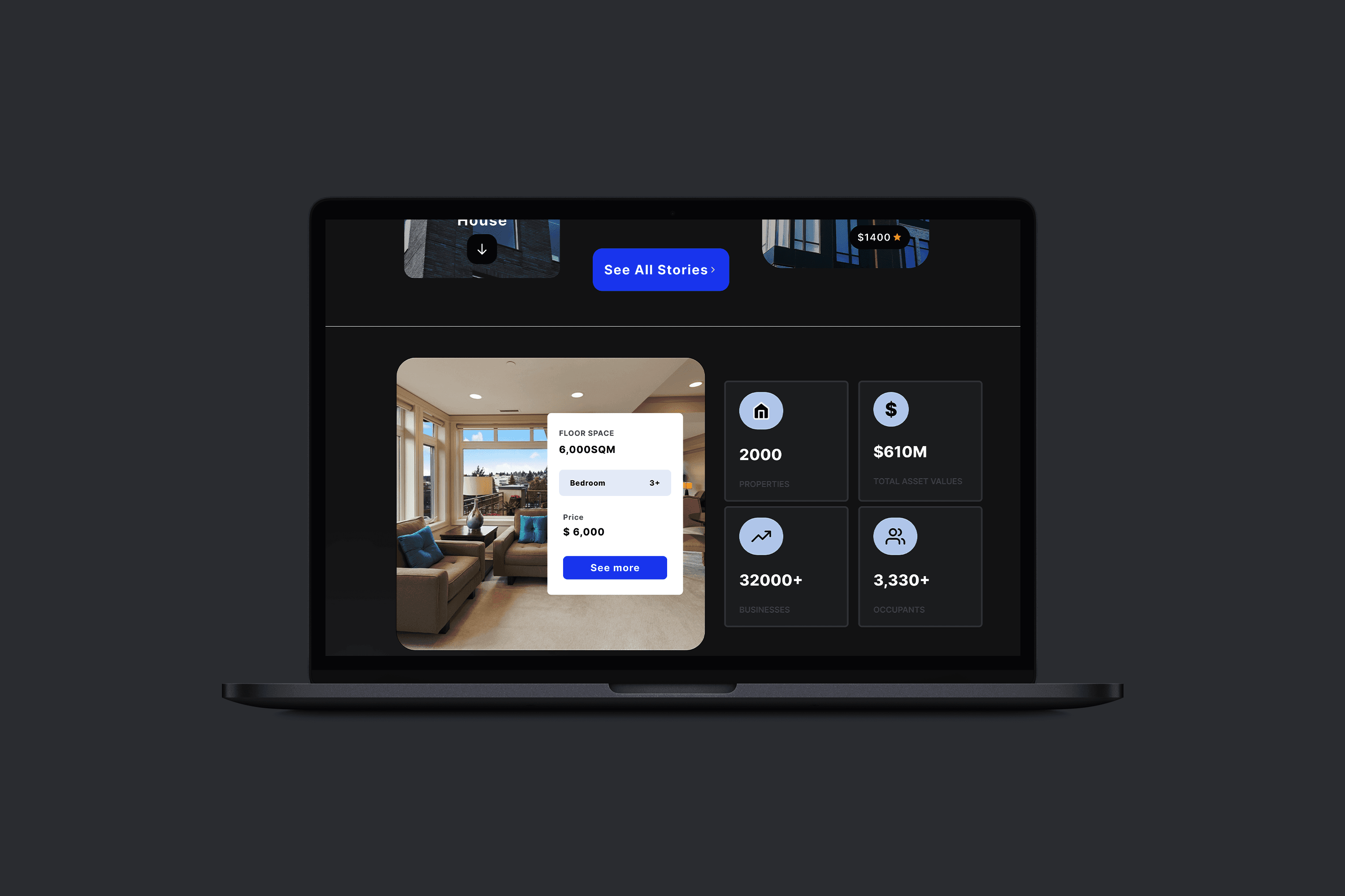
Homepage: Featured a prominent search bar and sections for featured properties and quick links.
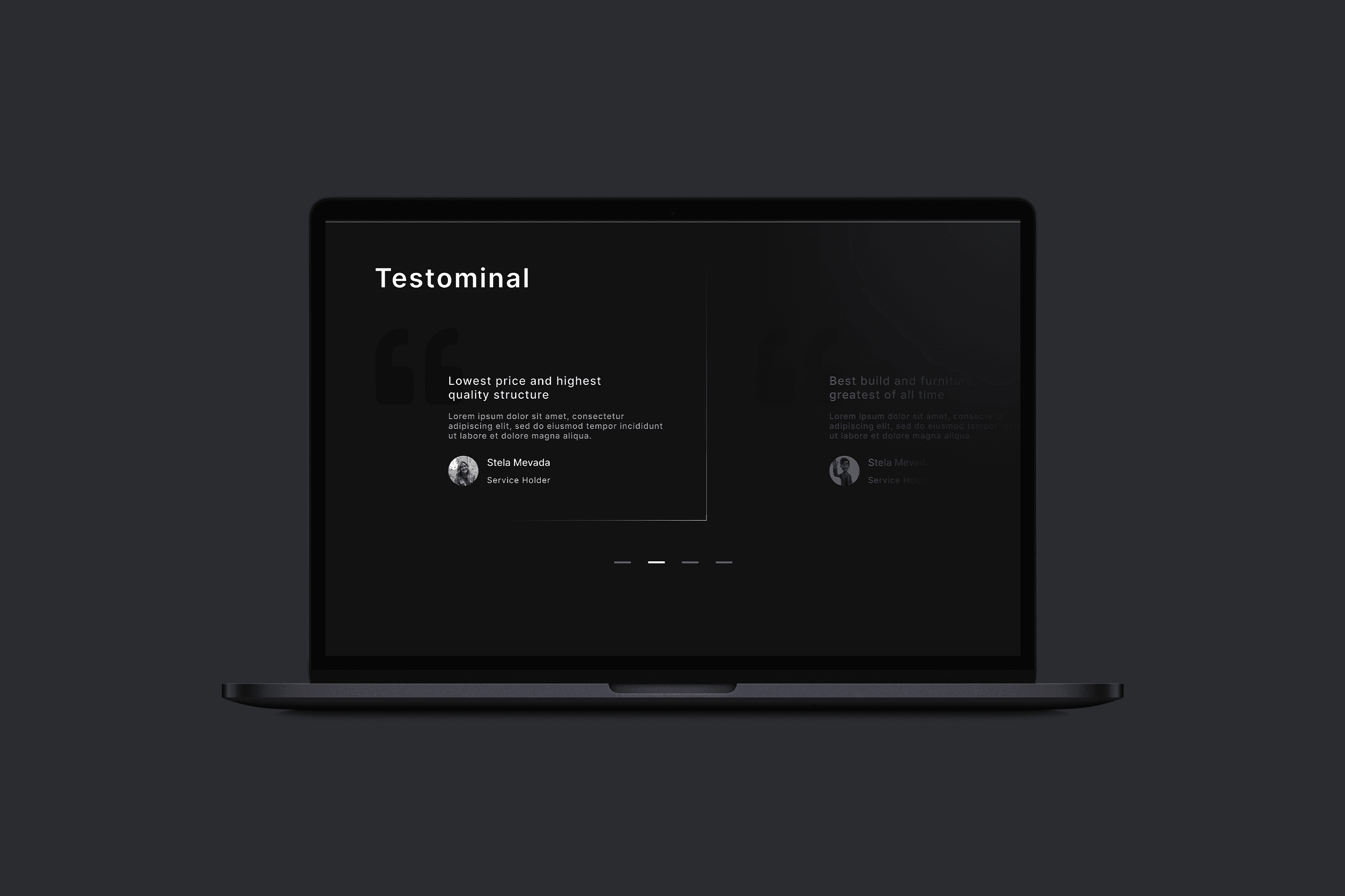
Search Results Page: Included property cards with images, prices, and key details, alongside filters for refining results.
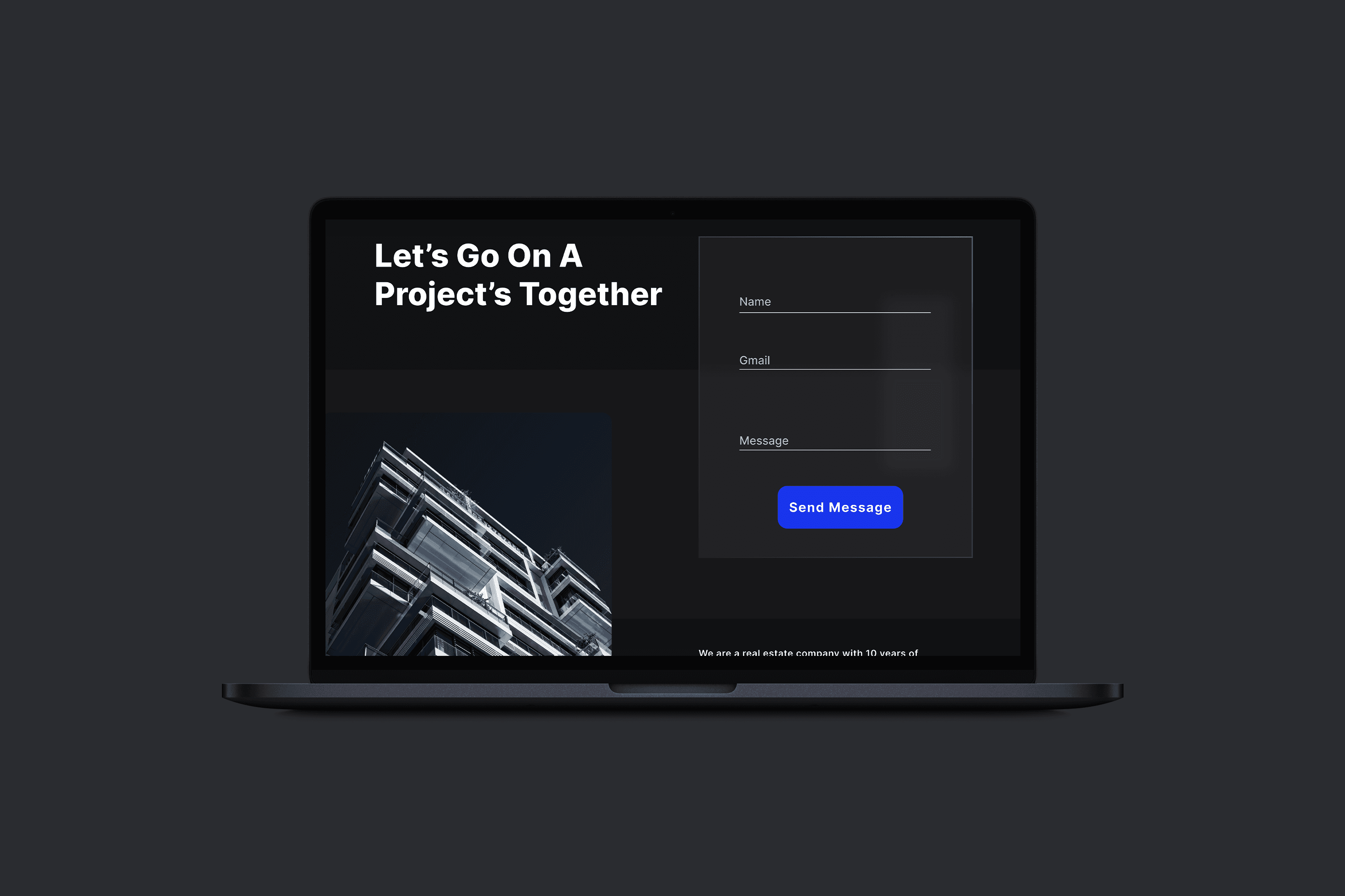
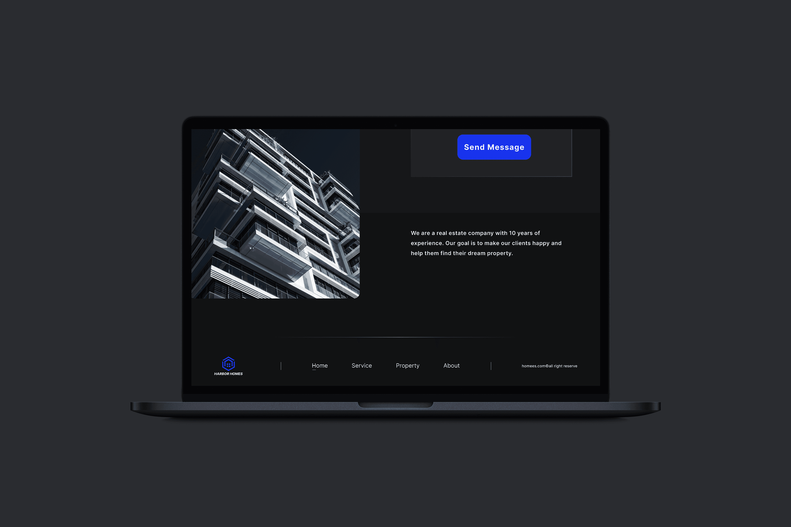
Property Details Page: Highlighted property images, descriptions, location maps, and an inquiry form.
Contact Us Page: Designed for easy communication between users and property agents.
Visual Design
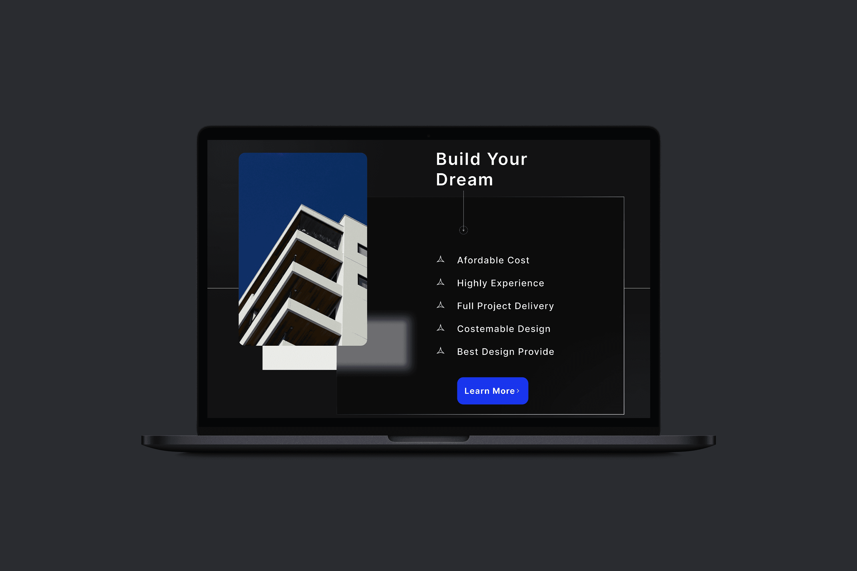
Adopted a minimalist design style with a clean layout, neutral colors, and bold accent tones for calls to action.
Used high-quality imagery to enhance the visual appeal of property listings.
Selected typography that ensured readability and professionalism.
Prototyping
Built an interactive prototype using tools like Figma or Adobe XD:
Integrated animations for smooth transitions between pages.
Showcased hover effects on property cards to reveal additional details without navigating away.
Simulated the search and filter functionality to demonstrate the user journey.
Testing and Refinements
Conducted usability testing with a focus group to gather feedback on:
Navigation and ease of use.
Effectiveness of search and filter functions.
Visual appeal and responsiveness.
Refined the design based on feedback, such as improving filter placement and enhancing the clarity of property cards.
Solution
Advanced Search and Filters
Designed a prominent search bar on the homepage with options to filter properties by location, price, size, and type.
Ensured filters were intuitive and easy to use, enabling users to narrow down their options quickly.
Minimalist Property Listings
Created property cards with high-quality images, concise details (e.g., price, location, size), and clear call-to-action buttons (e.g., "View Details").
Incorporated hover effects for additional interactivity and engagement.
Responsive Design
Optimized the website for mobile devices, ensuring smooth navigation and readability on smaller screens.
Used a grid-based layout to maintain consistency across devices.
Interactive Property Pages
Designed detailed property pages with a photo gallery, map integration, and a contact form for inquiries.
Included animations for smooth transitions between sections, enhancing user experience.
Streamlined Contact Process
simplified the contact form to reduce friction in user-agent communication.
Enabled users to directly submit inquiries from the property details page.
Results
Increased User Engagement
The clean and intuitive design resulted in a 30% increase in time spent on the platform during testing.
Higher Lead Generation
The simplified contact form and clear property information contributed to a 25% rise in inquiries.
Positive Feedback
Test users praised the minimalist design and ease of navigation, with a 90% satisfaction rate.
Improved Mobile Accessibility
Responsive design enhancements led to a 20% increase in mobile traffic.
Challenges
Defining Essential Features: Balancing simplicity with functionality required prioritizing user needs during planning.
Content Organization: Ensuring property details were clear and concise without overwhelming the user.
Maintaining Visual Consistency: Achieving a cohesive look across different screen sizes required multiple iterations.