ELEVATING BRAND EXPERIENCE
Brew Master BRAND GUIDELINES
COMPANY
Brew Master
ROLE
Brand Designer
EXPERTISE
UI/UX Design
YEAR
2024
About us
Brew Master is more than just a coffee brand—we are a community of coffee lovers who value quality, connection, and craftsmanship. At the heart of Brew Master is a dedication to creating an experience that goes beyond the cup, where every blend, every bean, and every brew reflects our commitment to excellence. With a warm, friendly, and knowledgeable approach, we welcome our customers into the world of coffee culture, inviting them to savor every moment. Brew Master stands for authenticity, consistency, and a passion for sharing the perfect coffee experience with everyone who walks through our doors.
Brand Personality
Warm
Brew Master welcomes every customer with a genuine, inviting presence, creating a comforting environment where everyone feels at home.
Friendly
Brew Master engages with a down-to-earth and approachable attitude, making coffee culture accessible and enjoyable for everyone, from beginners to enthusiasts.
Passionate
Brew Master is deeply committed to the art of coffee, from sourcing premium beans to mastering each brewing technique. This passion drives a relentless pursuit of excellence and quality.
Knowledgeable
Brew Master welcomes every customer with a genuine, inviting presence, creating a comforting environment where everyone feels at home.
Brew Master embodies warmth, passion, friendliness, and expertise, making every interaction inviting and memorable. Rooted in a love for coffee craftsmanship, Brew Master is a welcoming guide for all—whether you’re just discovering coffee or a seasoned enthusiast. By combining an approachable attitude with deep knowledge and dedication, Brew Master creates a unique space where customers feel valued, empowered, and connected to the world of coffee.
Brand Vision
Brew Master aims to be the preferred choice for coffee enthusiasts and professionals worldwide by providing premium-quality coffee beans, state-of-the-art brewing equipment, and a deep passion for the coffee craft. Thenvision represents Brew Master’s long-term goals and aspirations. This serves as the “north star” for the brand, guiding every decision and direction.
Brand Mission
Brew Master’s mission is to elevate the coffee experience by offering exceptional coffee products and innovative brewing solutions, grounded in craftsmanship and quality, from bean to cup. The mission drives day-to-day operations and decisions, helping the brand focus on delivering quality and innovation in every product.
Primary Logo
Our primary logo embodies the essence of Brew Master—a brand rooted in warmth, craftsmanship, and the art of brewing exceptional coffee.
The BM initials, combined with the gentle smoke design, evoke the comforting aroma of freshly brewed coffee, while the coffee bean-inspired line reflects our dedication to quality and authenticity.
As the centerpiece of our visual identity, the primary logo serves as the foundation of our brand. It is intended for prominent use, ensuring maximum visibility and recognition across all major brand touchpoints.
This logo symbolizes our mission to create meaningful coffee experiences and is best used on packaging, storefronts, and in official communications where the full identity needs to shine.
Secondary Logo
Our secondary logo simplifies the primary design into the BM initials, creating a versatile and recognizable logo mark.
This streamlined version retains the core elements of our identity, offering flexibility for use in settings where simplicity is key, such as social media profiles, merchandise, or smaller digital spaces.
The BM logo mark continues to reflect our brand's sophistication and warmth, ensuring that even in its minimal form, Brew Master's identity remains impactful and memorable.
Graphic Elements (Smoke + Coffee Bean Line)
The smoke and coffee bean-inspired line are unique elements derived from our primary logo, designed to add depth and personality to our brand.
These graphic elements are used as decorative features, patterns, or accents to enhance brand applications such as packaging, marketing materials, and digital assets.
When used as standalone components, they embody the sensory experience of coffee—the warmth, the aroma, and the craft—and seamlessly tie back to our visual identity.
Color Variations
At Brew Master, our color palette is designed to be flexible while maintaining consistency. The variations in tones—ranging from deep, rich shades to soft, creamy accents—work together to create a dynamic and cohesive brand identity across all mediums.
Dark Bistre (#342519) This is our boldest and darkest shade, symbolizing the richness of coffee beans and grounding the palette with sophistication. It’s ideal for backgrounds, typography, and elements requiring a strong, commanding presence.
Coffee Brown (#684F36) A slightly lighter and warmer tone, Coffee Brown provides variation by adding depth and warmth. It’s perfect for use as a secondary background or in elements that need a softer, more inviting feel.
Camel Tan (#B39977) This elegant and neutral shade serves as a perfect bridge between the darker tones and lighter accents. Camel Tan is excellent for creating subtle contrasts and adding sophistication to designs, such as highlights or accents.
White Chocolate (#EFE6D9) Our lightest shade, White Chocolate, brings brightness and approachability to the palette. It’s perfect for large background areas, whitespace, or to add a clean and fresh feel to any design.
Icon Only Lockup
The favicon is a highly distilled version of our graphic elements, designed for digital applications like website tabs and app icons. This compact form focuses on the smoke and coffee bean-inspired line, maintaining clarity and recognition even at very small sizes.
By leveraging these distinctive features, the favicon ensures that Brew Master’s brand presence remains strong and consistent in digital environments, no matter the scale.
Overall Logo System
Our logo system is built with flexibility in mind, ensuring that Brew Master's identity is adaptable to diverse applications while maintaining its integrity.
The primary logo represents the full story of our brand and should be used wherever possible.
The secondary logo (BM initials) offers a minimalist solution for smaller spaces, without losing the essence of our identity.
The graphic elements and favicon add supporting versatility, enhancing the brand experience in both digital and physical environments. Through this thoughtful system, our logo embodies the Brew Master mission: to bring warmth, quality, and sophistication to every coffee experience.
Logo Usage Guidelines
The Brew Master logo should not be used in a mannerthat could be perceived as misleading, offensive, or harmful. It is strictly prohibited to alter, distort, or combine the logo with other elements in a way that compromises its integrity or readability. To preserve the integrity of our logo, ensure adequate spacing, use approved color variations, and avoid distortion.
Applying random colors
Rotating in a weird angle
Stretching the logo
Applying effects or gradient
Applying space between the initails
Applying shadows
Visual Style
Brand Colors
The Brew Master logo should not be used in a mannerthat could be perceived as misleading, offensive, or harmful. It is strictly prohibited to alter, distort, or combine the logo with other elements in a way that compromises its integrity or readability. To preserve the integrity of our logo, ensure adequate spacing, use approved color variations, and avoid distortion. Examples incorrect usage are provided below
Primary Colors
Primary colors are the cornerstone of our brand identity. These colors dominate our designs and represent the essence of Brew Master’s personality. They are bold, recognizable, and essential for building a strong, cohesive brand presence.
Brew Master:
Dark Bistre (#342519): This rich, earthy tone represents the depth, quality, and craftsmanship of our coffee. It’s the foundation of our palette, symbolizing roasted coffee beans and the brand’s bold sophistication.
White Chocolate (#EFE6D9): A light, creamy shade that brings balance and warmth, reflecting Brew Master’s approachable and inviting nature. This color ensures a clean and modern look across all designs. Together, these primary colors form the backbone of our visual identity.
Dark Bistre
HEX #342519
RGB 52, 37, 25
CMYK 0, 29, 52, 80
White Chocolate
HEX #EFE6D9
RGB 239, 230, 217
CMYK 0, 4, 9, 6
Primary Typeface
Markazi is a sophisticated serif typeface with an elegant, timeless appeal. As the primary typeface, it embodies the warmth and craftsmanship of Brew Master, making it ideal for key brand elements like headings, titles, and highlights.
Why Markazi?
Its classic yet approachable style aligns with Brew Master's tone of voice: inviting, knowledgeable, and refined.
The serif design evokes tradition and trust, perfectly complementing the rich, elegant vibe of the brand.
Works well for printed and digital media, adding a professional yet artistic touch to the brand.
Use Cases:
Main headlines and titles (e.g., "Welcome to Our Brand Strategy").
Section headers for presentations, brochures, and menus.
Large-scale designs where elegance needs to stand out.
Markazi Regular
abcdefghijklmnopqrstuvwxyz
ABCDEFGHIJKLMNOPQRSTUVWXYZ
0123456789~!@#$%^&*()_+}{":?<,.';-
Markazi Medium
abcdefghijklmnopqrstuvwxyz
ABCDEFGHIJKLMNOPQRSTUVWXYZ
0123456789~!@#$%^&*()_+}{":?<,.';-
Markazi Semibold
abcdefghijklmnopqrstuvwxyz
ABCDEFGHIJKLMNOPQRSTUVWXYZ
0123456789~!@#$%^&*()_+}{":?<,.';-
Markazi Bold
abcdefghijklmnopqrstuvwxyz
ABCDEFGHIJKLMNOPQRSTUVWXYZ
0123456789~!@#$%^&*()_+}{":?<,.';-
Primary Typeface
Markazi is a sophisticated serif typeface with an elegant, timeless appeal. As the primary typeface, it embodies the warmth and craftsmanship of Brew Master, making it ideal for key brand elements like headings, titles, and highlights.
Why Markazi?
Its classic yet approachable style aligns with Brew Master's tone of voice: inviting, knowledgeable, and refined.
The serif design evokes tradition and trust, perfectly complementing the rich, elegant vibe of the brand.
Works well for printed and digital media, adding a professional yet artistic touch to the brand.
Use Cases:
Main headlines and titles (e.g., "Welcome to Our Brand Strategy").
Section headers for presentations, brochures, and menus.
Large-scale designs where elegance needs to stand out.
Satoshi Light
abcdefghijklmnopqrstuvwxyz
ABCDEFGHIJKLMNOPQRSTUVWXYZ
0123456789~!@#$%^&*()_+}{":?<,.';-
Satoshi Regular
abcdefghijklmnopqrstuvwxyz
ABCDEFGHIJKLMNOPQRSTUVWXYZ
0123456789~!@#$%^&*()_+}{":?<,.';-
Satoshi Medium
abcdefghijklmnopqrstuvwxyz
ABCDEFGHIJKLMNOPQRSTUVWXYZ
0123456789~!@#$%^&*()_+}{":?<,.';-
Satoshi Bold
abcdefghijklmnopqrstuvwxyz
ABCDEFGHIJKLMNOPQRSTUVWXYZ
0123456789~!@#$%^&*()_+}{":?<,.';-
Using Type Rules
Our client, a leading technology company, aimed to revolutionize scheduling processes worldwide by introducing the world's first AI-powered scheduling app
Our client, a leading technology company, aimed to revolutionize scheduling processes worldwide by introducing the world's first AI-powered scheduling app
Stay Left-Aligned.
Legibility and clarity are vitally important to great typographical layouts. Since most people read from left to right, we should align our type accordingly. And besides, we’re a little off-center as a brand anyway.
Skip Weights & Double Size
Contrast is the name of the game when it comes to great design. When in doubt, skip a weight when pairing two weights, and double the size between two text elements.
Align X-Heights or Baselines
Whenever you place text next to each other, either align the baselines (the line that the bottom of a lowercase x sits on) or align the x-heights (the top of a lowercase x). This helps align each line visually.
Watch The Rag
When setting paragraphs, keep an eye on the right (ragged) edge. If the rag unintentionally creates a recognizable shape, consider tweaking the language or resizing the container. Also, try to prevent single-word lines (orphans).
Give Things Space, If Needed
Negative space, or the space around elements is vitally important. That being said, if informational elements belong together, move them closer together. Use grouping wisely: just try not to cram too many things in one space!
Keep Line Length Reasonable
It is easy for the user to get lost in long lines of text, and short ones are easily ignored. It’s best to keep lines between 45 and 70 characters long, depending on the size of the font. This will ensure legibility as the font sizes increase or decrease.
Photography
Brew Master imagery should feel warm, inviting, and artisanal. Prioritize natural lighting, warm tones, and storytelling moments.


Brand Collaterals
Brand Partern
The brand pattern is a visual asset derived from key elements of the Brew Master logo, such as the smoke design and the coffee bean-inspired line.
Why It’s Important:
The brand pattern reinforces Brew Master’s identity across various touchpoints, creating a consistent and recognizable look. It adds texture and depth to designs while reflecting the brand’s story and values.Message:
The repeating pattern symbolizes the warmth and richness of the coffee experience, embodying the sensory connection Brew Master brings to its audience.
It is versatile, making it ideal for use in packaging, marketing materials, digital backgrounds, and in-store decor.Applications:
The brand pattern can be used subtly to accentuate designs or boldly to create standout visuals. Examples include:Packaging: Adding sophistication to coffee boxes, cups, and bags.
Digital Design: Enhancing social media posts, banners, and website backgrounds.
Merchandise: Elevating apparel and accessories like tote bags, aprons, and T-shirts.
In-Store Design: Adding warmth and cohesion to interiors, such as wall art or menu boards.

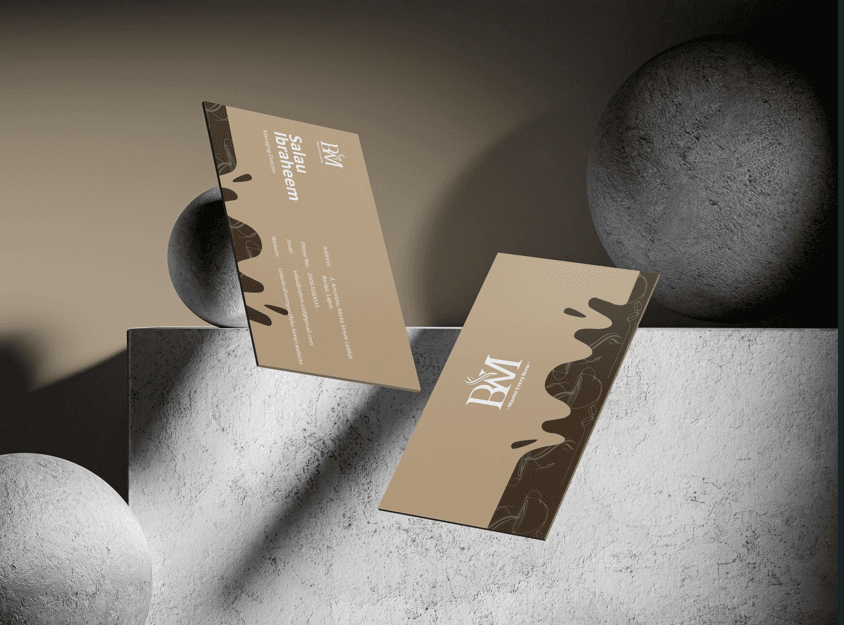
Business Cards
The business card serves as a personal connection point between Brew Master and its audience.
It combines professionalism with a warm, inviting design that reflects the brand's personality.
Why It’s Important:
A well-designed business card leaves a lasting impression, whether shared with potential partners, suppliers, or customers.Message:
Each card reinforces the Brew Master promise—quality, craftsmanship, and passion for coffee.
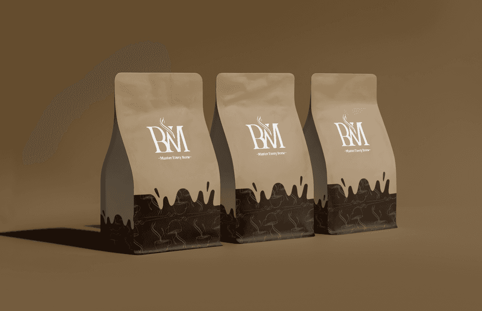
Coffee Beans Box Packaging
The coffee beans box packaging is specifically designed to preserve the freshness and aroma of Brew Master’s carefully selected beans.
Why It’s Important:
It highlights the premium quality of the beans and the brand’s commitment to providing an exceptional coffee experience.Message:
The packaging combines functionality and design, offering a refined look while protecting the beans’ integrity, ensuring every cup brewed is as fresh as possible.
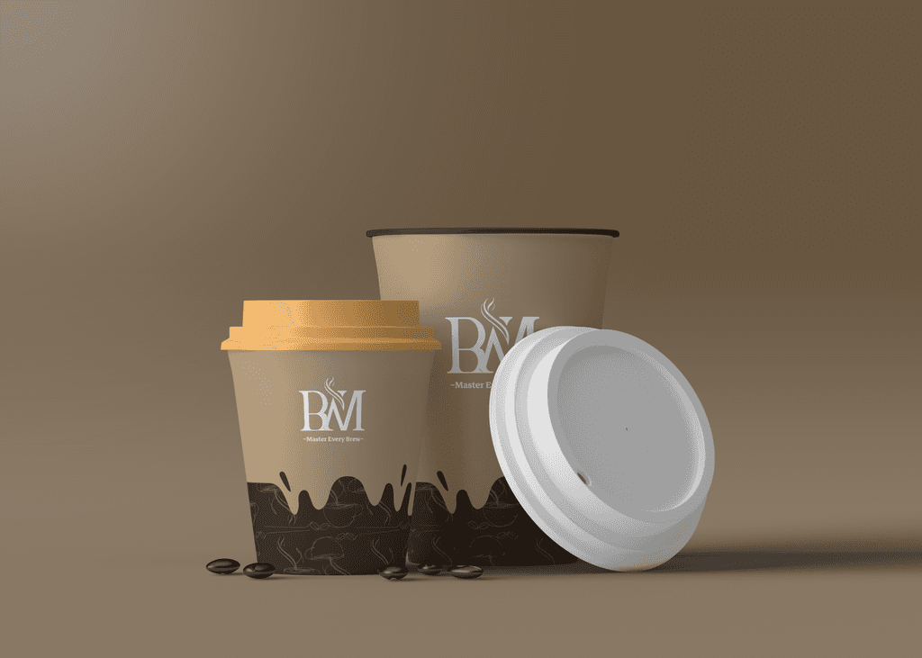
Cup
The cup is the ultimate customer touchpoint, embodying Brew Master’s commitment to the coffee experience.
Why It’s Important:
It’s a tangible representation of the brand, seen and held by customers during every sip.Message:
The cup design combines elegance and functionality, reinforcing Brew Master’s focus on delivering quality coffee moments.
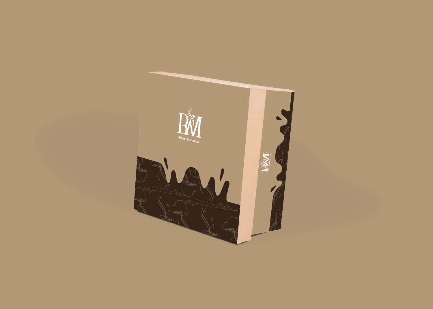
Box Packaging
Brew Master’s box packaging is crafted to protect and showcase its products while delivering a premium unboxing experience.
Why It’s Important:
The packaging serves as an ambassador for the brand, making a strong first impression both on shelves and in delivery.Message:
With its elegant design and clear branding, the box ensures that customers associate Brew Master with sophistication and care.
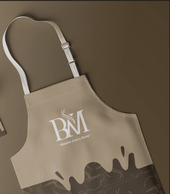
Apron
The apron represents Brew Master’s craftsmanship and attention to detail in every cup of coffee brewed.
Why It’s Important:
It is a key part of the barista's uniform, reinforcing professionalism and the artistry behind each coffee experience.Message:
Featuring the logo and patterns, the apron elevates the brewing process into a visual extension of the brand’s core values.
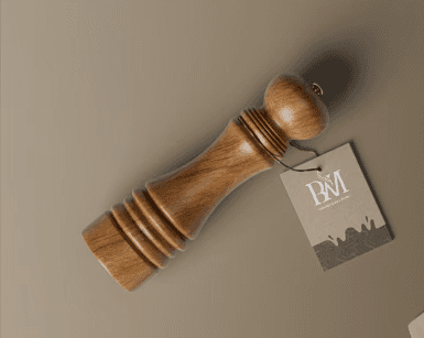
Tag
Tags are small but powerful branding tools, used on coffee bags, merchandise, and other products.
Why It’s Important:
They add a personal touch and provide critical details like product information, care instructions, or sustainability certifications.Message:
Each tag is a storytelling element, connecting customers to Brew Master’s mission of quality and sustainability.
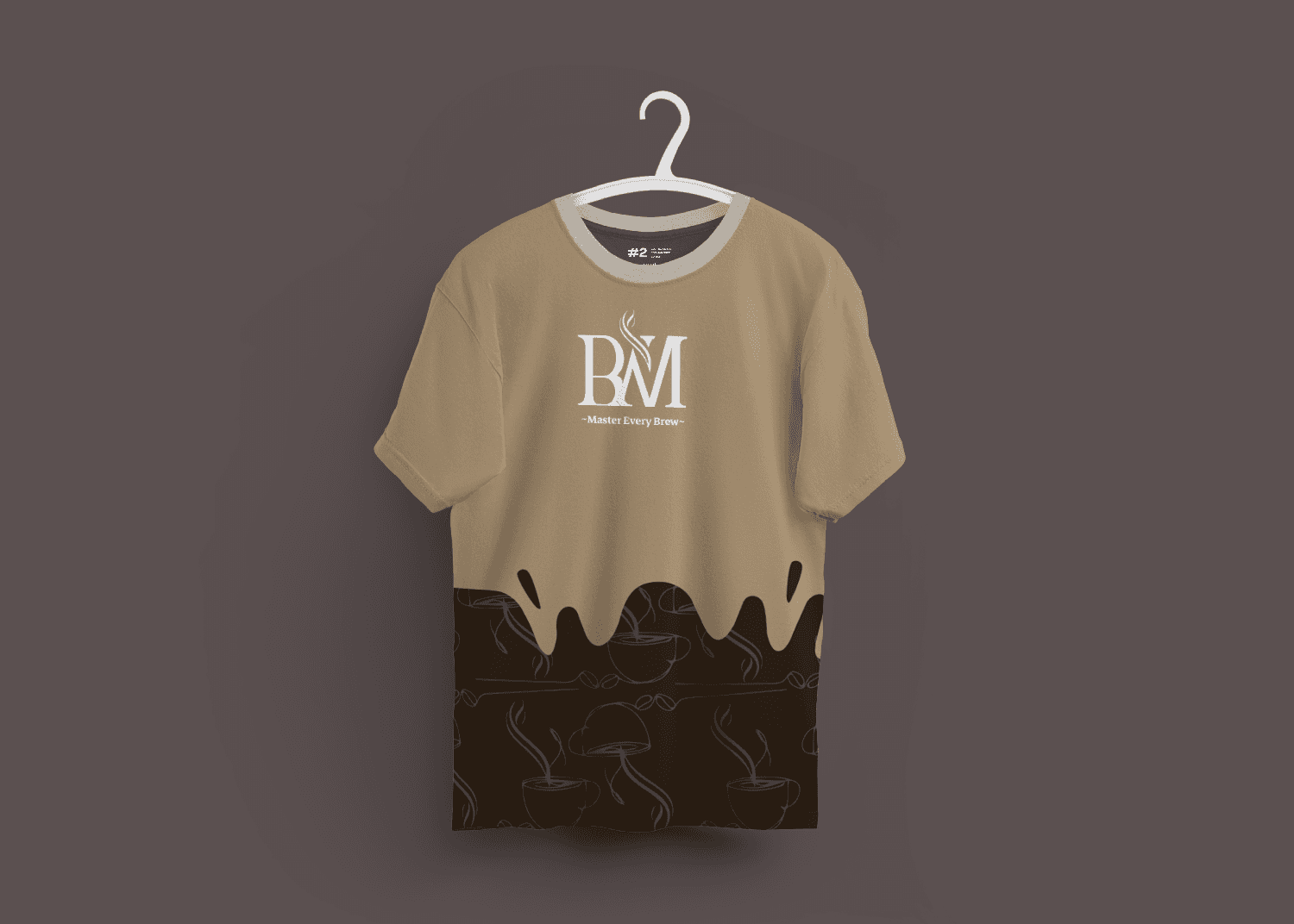
T-Shirt
The T-shirt is a versatile, everyday item that promotes Brew Master's identity in a relaxed and approachable way.
Why It’s Important:
T-shirts create brand ambassadors who carry the Brew Master story into their communities.Message:
Each T-shirt is designed to reflect the brand's warmth and quality, creating a casual connection with customers.
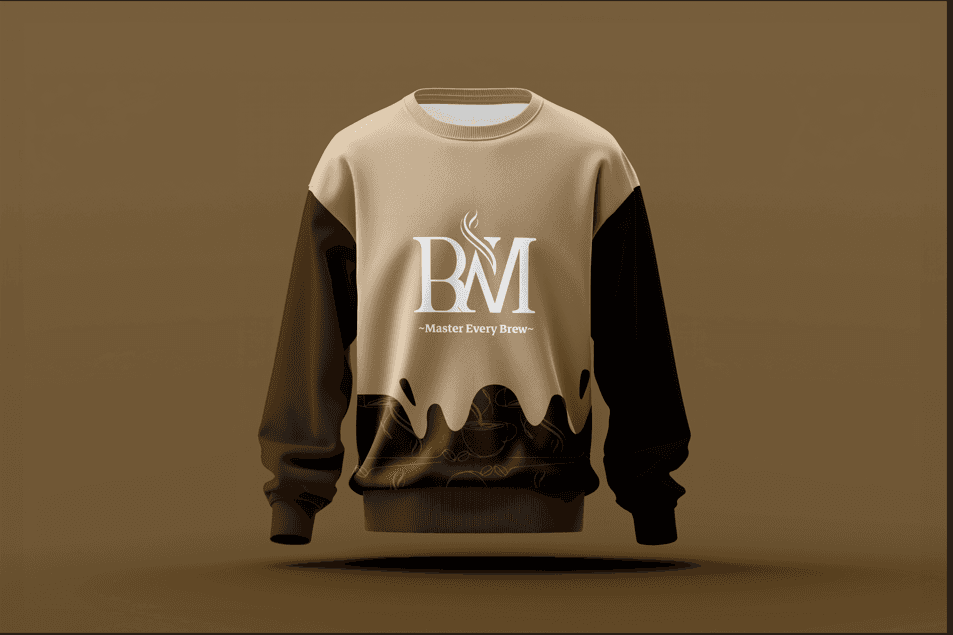
Sweatshirt
The sweatshirt is a comfortable yet stylish piece of merchandise that embodies the Brew Master lifestyle.
Why It’s Important:
It extends the brand's reach into casual apparel, helping fans of the brand feel connected even beyond the coffee experience.Message:
Brew Master's sweatshirts showcase the logo and tagline, making it a wearable statement of warmth and sophistication.